Did you ever experienced the problem when you have a couple of items in the same line/row in a HTML region and you have a select list (in the next row) which becomes so Hugh that the upper items places more and more to the right. It just looks ugly and the select list value
normally changes dynamically.
 What to do?
First we need to bring a logical barrier in between the line breaks.
Using a "Stop and Start HTML Table" object in between text items and select list.
It will look like that:
 Result: Just the text label is incorrect anymore.Now we have two choices:
 1. Using
Problem: The more text different there are, the more
2. Creating a SPACER item
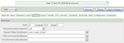
Create a new display only item called :P1_SPACER in front of the first text item. Now add the following text under "Element Table Cell Attributes" > style="width:200px"
 Edit the pixel value so that it fits into your page.
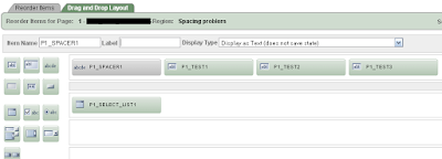
 The region items will be listed like that:
 In case you still have some problem with different browser presentations look at my last post.
Update 17.03.2009:
Just tested a really good hint from Patrick.
Using the ColSpan option in the select list item saves all other steps above. Set the value for ColSpan (in my case) to 3 and the same result appears. Good that I never stop learning...

normally changes dynamically.
 What to do?
First we need to bring a logical barrier in between the line breaks.
Using a "Stop and Start HTML Table" object in between text items and select list.
It will look like that:
 Result: Just the text label is incorrect anymore.Now we have two choices:
 1. Using
   object until it fits. Text1: Problem: The more text different there are, the more
  you will need.2. Creating a SPACER item
Create a new display only item called :P1_SPACER in front of the first text item.
 Now add the following text under "Element Table Cell Attributes" > style="width:200px"
 Edit the pixel value so that it fits into your page.
 The region items will be listed like that:
 In case you still have some problem with different browser presentations look at my last post.
Update 17.03.2009:
Just tested a really good hint from Patrick.
Using the ColSpan option in the select list item saves all other steps above. Set the value for ColSpan (in my case) to 3 and the same result appears. Good that I never stop learning...
